Component mindset
Repeated patterns for headers, cards, and calls to action so the site stays consistent as content grows.
Interface and layout work for a nonprofit site: structured pages in Figma, then implementation priorities that respect accessibility and clarity on every screen size.
Visit pjcmillstone.org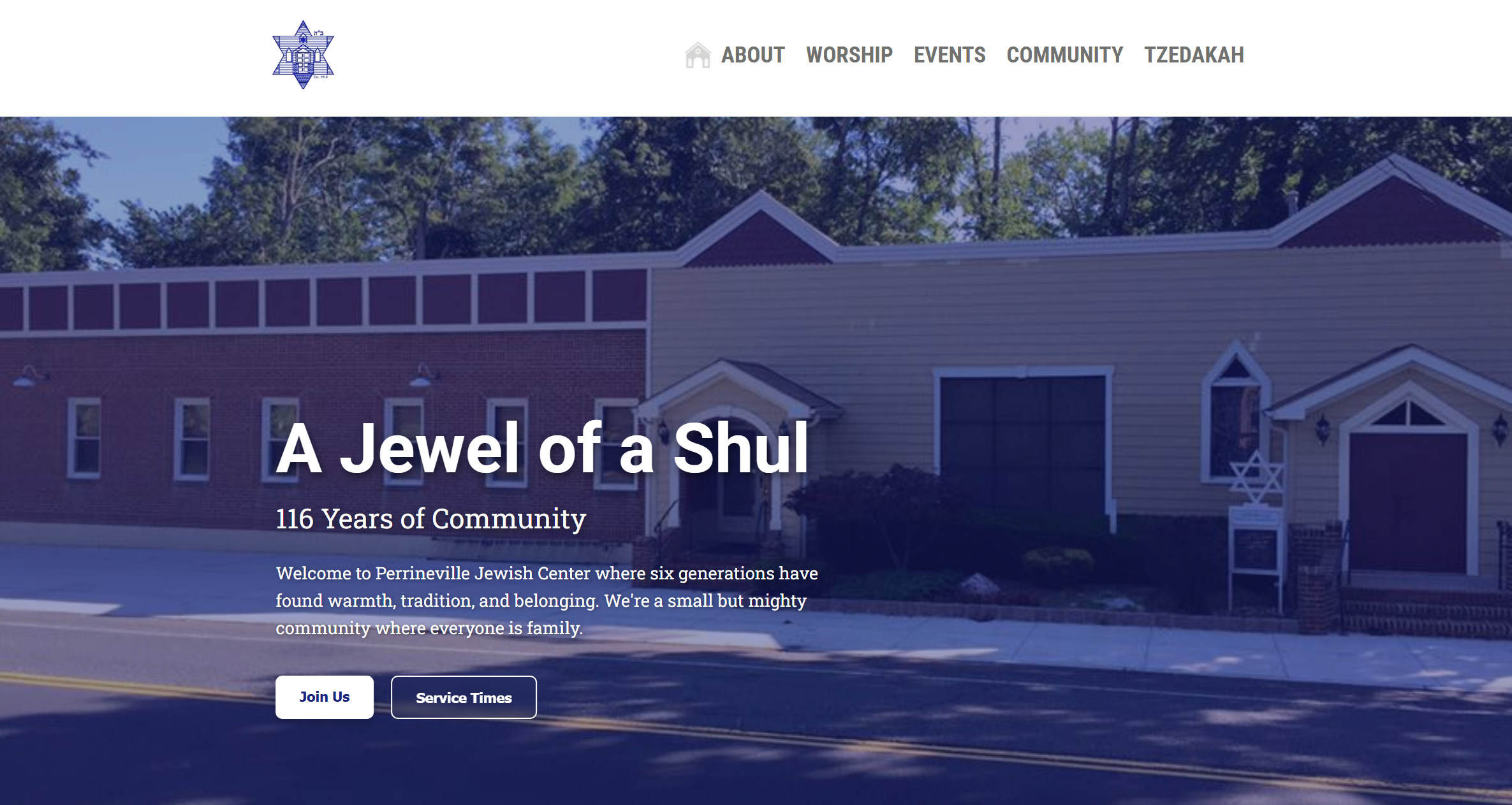
Design
The Figma file anchored page hierarchy, typography, and spacing before build. That made it easier to align stakeholders on structure and to hand off consistent specs for the live site.
Overview
The focus was a calm, readable experience: clear navigation, scannable content blocks, and predictable interaction patterns so visitors can find programs and resources without friction.
Working alongside the organization meant balancing brand voice with practical constraints—performance, maintainability, and accessibility were part of the design conversation from the start.
Highlights
Repeated patterns for headers, cards, and calls to action so the site stays consistent as content grows.
Contrast, focus states, and semantic structure so the site works for more people and assistive tech.
Breakpoints and stacking behavior tested so the same design intent holds on phone, tablet, and desktop.
A product web app—React, TypeScript, and Supabase—with Radix primitives and a polished client experience.
All projects