Navigation simplification
Top-level navigation was reduced from 7 tabs to 5 to better match user priorities and cut cognitive load.
A two-month solo internship focused on redesigning a nonprofit website for clarity, accessibility, and long-term maintainability inside a constrained ShulCloud environment.
The organization needed a site that older community members could use comfortably and that board members could update on their own after the internship. The existing experience had too many top-level navigation options, small text in important areas, and inconsistent behavior across screen sizes.
The main constraint was technical: implementation had to happen inside ShulCloud rather than a fully custom HTML/CSS/JS build. That meant every design decision had to balance visual clarity with what the platform could realistically support.
Work started by gathering board input on what visitors needed most, how they expected to navigate, and what felt confusing in the current structure. That lightweight feedback loop shaped the information hierarchy before visual polish.
Figma was then used to map page layout, spacing, and content rhythm so expectations were clear before implementation. The design file made trade-offs visible early, especially around what could and could not be executed in ShulCloud without creating a maintenance burden for non-technical editors.
Development followed the same structure: build the highest-impact templates first, then adapt each section to ShulCloud modules while preserving hierarchy, readability, and responsive behavior. Some visual ideas were simplified to fit platform constraints, but the priority stayed consistent throughout—ship a clear interface the board could confidently maintain after handoff.
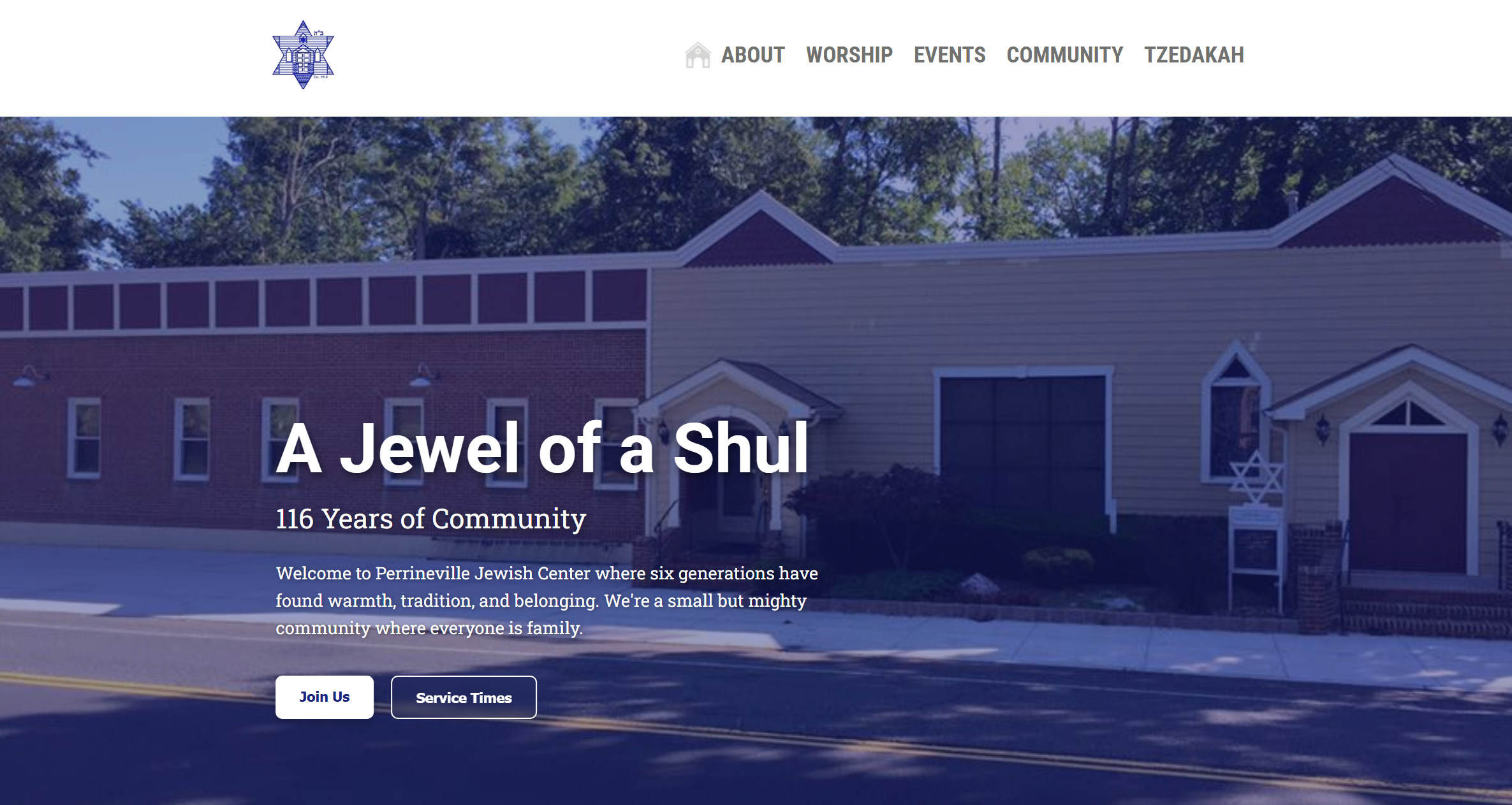
The shipped experience focused on reducing friction for core tasks: finding programs, locating key information, and navigating confidently on mobile. Navigation was condensed from seven top-level tabs to five, making the structure easier to scan and reducing decision load.
Visual direction was also updated to better match the organization's future vision, replacing a dated white and mint palette with a more intentional system while improving readability through larger text and clearer spacing.
Top-level navigation was reduced from 7 tabs to 5 to better match user priorities and cut cognitive load.
Type sizing and content spacing were adjusted for an older audience so key actions and information are easier to read.
Design patterns were adapted to platform limits so the site remained editable for board members after handoff.
The project launched with positive board feedback and only minor content revisions after review. Most changes after delivery were editorial, which indicated the core structure and interaction model were working for the team.
The most meaningful outcome was operational: the site was intentionally structured so board members could maintain content themselves, reducing dependence on ongoing developer intervention for routine updates.
This internship reinforced that strong UX work is often constraint work. The goal was not a perfect custom build; it was making a legacy system feel clear, modern, and usable for real people with real editing workflows.
If revisiting the project, I would add lightweight usability sessions with older members using specific tasks and capture baseline accessibility checks before and after launch to quantify progress more clearly.
A product web app—React, TypeScript, and Supabase—with Radix primitives and a polished client experience.
All projects