Direckt.
Direckt started as a campus accessibility concept in the Mayo Business Plan Competition at TCNJ, then became a working web product with a defined design system, typed frontend architecture, and repeatable deployment pipeline.
1
Context & Constraints
Direckt originated during the Mayo Business Plan Competition at TCNJ, a multi-round university venture competition where student teams validate a business model, pitch to judges, and compete for seed funding. Our team placed 3rd and was awarded $10,000 in seed funding. The core problem was fragmented campus accessibility information: students and visitors often had to combine static PDFs, outdated building notes, and informal guidance to plan basic movement across campus.
We operated under strict constraints. Business constraints included a fixed competition timeline, limited resources, and the need to communicate value to judges and non-technical stakeholders quickly. Technical constraints included a two-person build effort, no dedicated backend team, and the requirement to demonstrate realistic user flows before institutional data partnerships were in place. That forced us to prioritize a production-style frontend architecture with mockable data boundaries and explicit accessibility standards from day one.
2
Brand & Identity Methodology
The identity work started with hand sketches and failed logo directions before moving into Adobe Illustrator. The first concept established direction, but it did not hold up across small UI contexts, monochrome states, and horizontal layouts. I returned to sketching, isolated the arrow-in-motion concept, and rebuilt the mark and wordmark as scalable vectors.
Building a vector brand system before writing core UI code reduced downstream rework. It gave us stable assets for navigation, app icons, and marketing surfaces while preserving consistency across breakpoints and export targets. Typography followed the same process: multiple font families were tested for readability and tone, then narrowed to Rubik for headings and Atkinson Hyperlegible for body copy to support clarity and accessibility. The blue palette was chosen for clear contrast and familiar trust signaling in institutional contexts, not for decoration.


3
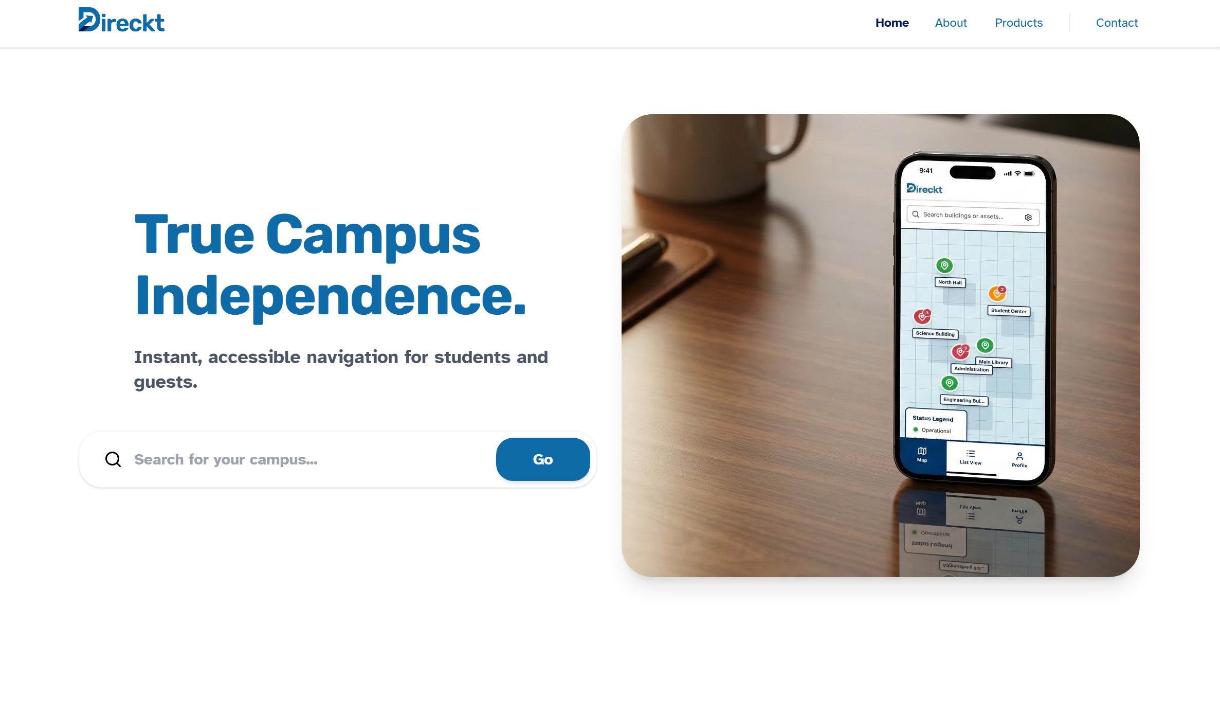
Interface Design & Prototyping
UX work started with flow definition before visual polish. We mapped core journeys first (discover route, inspect accessibility details, manage assets in admin), then translated those into low-fidelity wireframes to remove ambiguity around states, hierarchy, and navigation handoffs.
A Figma component system was established before frontend implementation: shared spacing rules, type scale, semantic color tokens, and reusable components for cards, forms, dialogs, and navigation elements. This made it possible to iterate on structure and interaction patterns in design files instead of rewriting React components during every product discussion.
You can interact with the prototype here: direcktaccess.com/example-campus.
4
Frontend Architecture
The frontend stack is React, TypeScript, Vite, and Tailwind. React provided predictable component composition for multi-surface flows (marketing pages, user app views, and admin views). Tailwind enabled fast, consistent implementation against design tokens without maintaining large custom CSS abstractions early.
Vite was chosen over Create React App for practical reasons: faster cold starts, faster hot-module replacement, and leaner production output with less bundler overhead. TypeScript was enforced across the codebase to make component contracts explicit, catch prop/data mismatches early, and keep route-level state transitions auditable as the project expanded.
5
Accessibility Implementation (The "Messy Middle")
We used Radix UI primitives as the baseline for accessible interactions, then adapted styling and behavior to our layouts. The difficult part was not rendering components; it was preserving keyboard and screen-reader behavior in complex states.
One repeated hurdle was coordinating map interactions with dialogs and detail panels. Opening a dialog from a map marker could easily break focus order, trap keyboard users in nested regions, or produce unclear announcements for screen readers. The solution required explicit trigger labeling, controlled focus return on close, and strict testing of tab/shift-tab escape paths across overlays. That work was iterative and often required rolling back visually correct implementations that failed interaction audits.
6
Data & Deployment Strategy
Supabase handled authentication and data access boundaries so the frontend could move from mock states toward production data without rewriting core flows. Environment-based configuration kept secrets out of the client bundle and allowed local development, preview deployments, and production to share one predictable setup model.
Deployment was structured as a repeatable workflow: GitHub as source of truth, branch previews on Vercel, review before merge, then production promotion to direcktaccess.com. The goal was not a one-time launch; it was a reliable CI/CD loop where every change could be tested in isolation and shipped with low operational risk.
LinkedIn Update
Learn more about the experience on my LinkedIn.
A Chrome extension that flags AI-generated ecommerce content—ML, backend API, and proactive alerts.
All projects